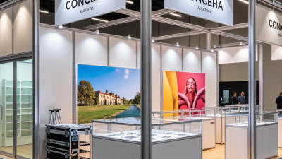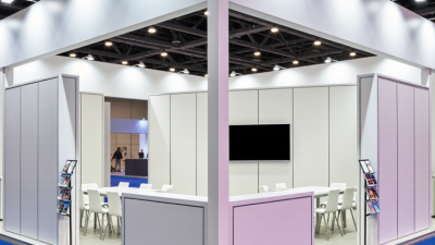
Choosing the right Booth Exhibition Stand is not simply a matter of selecting attractive walls, bright lights, and a convenient price. It is a practical decision about visitor movement, brand credibility, staff comfort, and measurable business goals. A stand may look impressive in a supplier’s showroom, yet feel crowded under harsh venue lighting. That gap deserves attention.
Susan Friedmann, CSP, a respected tradeshow consultant known as “The Tradeshow Coach,” says, “People buy from people they know, like, and trust.” Her observation gives this topic a useful direction. A successful Booth Exhibition Stand should invite genuine conversation, not merely display products. Open entrances, clear graphics, reachable demonstrations, and seating that supports discussion can influence how visitors respond. Small details matter.
This guide explores 10 practical tips for making a more informed choice. It considers stand size, layout, materials, lighting, storage, accessibility, installation, sustainability, and budget control. It also looks at how to compare suppliers without relying on polished promises alone. Ask for verified project examples. Check production timelines. Confirm what happens after installation.
Some decisions will remain imperfect. A larger stand does not automatically create better engagement. More technology can sometimes distract from the message. Even an experienced exhibitor may misjudge visitor flow. Reflection is part of the process. The strongest choice usually comes from balancing visual appeal with real operational needs. A reliable Booth Exhibition Stand should work on the show floor, during busy conversations, and after the event when results are reviewed.
10 Tips for Choosing the Right Booth Exhibition Stand
A suitable exhibition stand begins with a clear business goal. Decide whether you need qualified leads, product demonstrations, or stronger brand awareness. Your objective should shape the stand’s size, layout, lighting, and visitor journey. A lead-generation stand needs private conversation areas and visible enquiry points. A demonstration stand needs safe access, strong power planning, and an uncluttered display. Define your visitor profile too. Consider their job roles, buying concerns, language, and average visit time.
Tip: Write one goal and three visitor needs before choosing a stand design.
Study how visitors behave in the venue. Some stop near tall graphics, while others prefer open entrances and quick product information. Use readable messages from several metres away. Place staff where they can welcome visitors without blocking the aisle. A small table, two chairs, storage space, and accessible circulation can improve comfort. I once preferred a dramatic layout, but it reduced useful conversation space. That was a costly design lesson.
Tip: Sketch the visitor path from the aisle to the main conversation area.
Test your plan with real people before production. Ask a colleague to find the key message in ten seconds. Ask another person to explain the stand’s purpose after viewing it briefly. Their answers may expose confusing wording or weak positioning. Review visitor feedback from previous exhibitions, even when it feels negative. Reliable decisions come from evidence, not only attractive renders. Allow room for adjustment, because visitor reactions rarely match every assumption.
10 Tips for Choosing the Right Booth Exhibition Stand?
Choose a Stand Layout That Fits Your Space and Budget
Begin with the floor plan, not the display design. Measure ceiling height, access points, storage limits, and neighboring stands. A 3-by-3-metre space needs discipline. Use one clear reception point, a compact product zone, and open sightlines. Avoid building a small maze. Visitors should understand your offer within a few seconds.
Budget for the whole experience, including transport, installation, lighting, graphics, storage, and dismantling. A modular frame can reduce repeated production costs, especially when event sizes change. CEIR reports that 81% of trade show attendees have buying authority, so the layout should support practical conversations. Add two comfortable discussion areas, but protect the main walkway. Privacy matters. Do not overcrowd it.
Industry data also supports purposeful face-to-face design. UFI’s Global Exhibition Barometer tracks exhibitions as major business platforms, while Freeman’s 2024 Trends Report found that many attendees value live events for connection and trust. These findings do not justify expensive construction alone. My own mistake was prioritizing a dramatic overhead feature over usable meeting space. It looked impressive, but staff struggled to move around. Recheck every square metre. A smaller stand with better flow may perform better than a larger, crowded one. Test the visitor path with tape before approving the final drawings.
Choose a Stand Layout That Fits Your Space and Budget
Standard modular booth footprints commonly include 3 × 3 m, 3 × 6 m, 6 × 6 m, and 6 × 9 m layouts. Their floor areas are calculated from the published dimensions: 9, 18, 36, and 54 square metres. Smaller layouts can help control construction, transport, and staffing costs, while larger spaces provide more room for demonstrations, storage, meetings, and visitor flow. Select the largest footprint your budget and venue allocation can support without compromising usability.
Choosing the right exhibition stand starts with materials, not decoration. Select aluminum frames for lighter transport and repeated use. Use rigid panels where sharp product images need a stable surface. Check fire ratings, recycled content, cleaning requirements, and replacement costs. Ask for load-bearing details before approving shelves or suspended signs. A glossy finish may attract attention, but fingerprints can weaken the presentation.
Branding should work from three distances: aisle, conversation, and close inspection. Keep the main message under seven words. Use one dominant color, strong contrast, and a readable typeface. The Freeman Trends Report 2024 found that 74% of attendees consider events an effective way to build community. That value depends on visual clarity, not just attendance. Place the logo high, but do not let it dominate every panel. People remember useful messages better than repeated symbols.
Visual communication also needs evidence. UFI’s Global Exhibition Barometer reports continuing growth in face-to-face exhibition activity, increasing pressure on exhibitors to perform well. Show one product benefit with a real object, short diagram, or measured result. Use lighting to guide movement toward a demonstration area. Avoid screens without a clear purpose. They often become expensive wallpaper. Test the stand from five metres away, then from one metre. If visitors cannot explain the offer in ten seconds, revise it. My own practical mistake was trusting a beautiful mock-up; the final build felt crowded because storage was ignored.
| Tip | Evaluation Dimension | Recommended Standard or Benchmark | What to Check Before Ordering | Visual Communication Benefit | Priority |
|---|---|---|---|---|---|
| 1 Match the stand to the exhibition space | Footprint, height, access, and venue regulations | Confirm all dimensions in writing | Check the allocated floor area, maximum height, ceiling restrictions, neighboring stands, emergency routes, and loading access. | A correctly proportioned stand creates clear sightlines and avoids visual clutter in the visitor approach area. | Essential |
| 2 Select durable structural materials | Frame strength, panel stability, portability, and reuse | Use a load-rated modular system | Review the frame specifications, connection method, panel thickness, weight capacity, fire-safety documentation, and replacement options. | A stable structure keeps graphics flat, lighting aligned, and the presentation professional throughout the event. | Essential |
| 3 Choose graphics that resist wear | Print substrate, color consistency, cleaning, and transport protection | Use abrasion-resistant, low-glare surfaces | Request a physical sample and check color accuracy, edge finishing, wrinkle resistance, washability, and packaging protection. | Clean, consistent graphics support brand recognition and remain readable under exhibition lighting. | High |
| 4 Apply a clear visual hierarchy | Headline, supporting message, imagery, and call to action | One primary message per viewing zone | Ensure the main headline is visible from the aisle and that supporting copy does not compete with the key message. | Hierarchical design helps visitors understand the offer quickly while walking past the stand. | Essential |
| 5 Keep text readable at a distance | Font size, contrast, line length, and viewing distance | Use high contrast and short copy | Test the artwork at actual scale and view it from typical aisle distances of approximately 3–6 metres. | Large, high-contrast wording improves recognition before visitors reach the stand. | High |
| 6 Plan lighting as part of the design | Illumination level, color temperature, glare, and power demand | Use even, glare-controlled lighting | Confirm fixture positions, electrical load, cable routing, heat management, dimming requirements, and venue approval. | Balanced lighting draws attention to products and prevents shadows from weakening graphics or demonstrations. | High |
| 7 Design for visitor flow | Entry points, circulation, demonstrations, and queue space | Keep main routes open and intuitive | Map visitor movement from the aisle to reception, product displays, meeting areas, storage, and exit points. | A logical layout reduces congestion and makes the stand easier to explore and remember. | Essential |
| 8 Balance open space with storage | Storage capacity, furniture placement, accessibility, and appearance | Hide operational items from sight | Allow space for literature, personal belongings, packaging, cleaning supplies, and replenishment stock without blocking visitor areas. | A tidy stand protects the intended message and maintains a polished visual impression during busy periods. | High |
| 9 Use materials that support reuse | Modularity, repairability, recyclability, and transport efficiency | Prioritize reusable components | Ask whether panels, frames, lighting, and counters can be reconfigured for different spaces and transported in protective cases. | Reusable components allow consistent communication across events while reducing design and production changes. | Medium |
| 10 Verify installation and measurement quality | Artwork proofing, assembly time, inspection, and contingency planning | Approve a full-scale or detailed proof | Confirm final artwork, color references, hardware quantities, installation instructions, delivery timing, and an on-site inspection process. | Accurate production prevents misaligned graphics, missing elements, and last-minute changes that weaken communication. | Essential |
A booth should work before it looks impressive. During stand reviews, I check storage, cable routes, lighting, flooring, and staff movement first. A narrow entrance can create queues. Weak shelving can damage products or interrupt demonstrations. CEIR reports that 81% of exhibition attendees influence or make purchasing decisions. Therefore, your team needs clear conversation zones, not only attractive graphics. Test the stand with real staff before shipping it.
Technology should remove friction, not create another problem. Use bright screens, reliable Wi-Fi, simple product demonstrations, and consent-based lead capture. Every device needs a backup plan. A printed product sheet may save a failed presentation. UFI’s Global Exhibition Barometer reported that global exhibition activity reached about 97% of 2019 levels in 2023. Competition is active again, so slow technology is noticeable. I once focused too much on interactive displays and ignored queue space. That was a costly design mistake.
Visitor experience depends on small physical details. Keep the main message visible from the aisle. Provide seating for serious conversations. Use lighting that shows product surfaces accurately. Staff should greet visitors without blocking the entrance. Freeman research on live experiences repeatedly emphasizes human connection and hands-on engagement. Treat that as practical guidance, not decoration. A beautiful stand can still feel confusing. Ask five unfamiliar people to navigate it. Watch where they hesitate. Their hesitation is useful evidence.
10 Tips for Choosing the Right Booth Exhibition Stand
After reviewing exhibition builds, I have learned that the lowest quote rarely shows the complete cost. Compare at least three suppliers using the same booth size, materials, graphics, furniture, lighting, transport, and labor. Ask for recent project photos, floor plans, and client references. A reliable supplier explains what is included and what is excluded. Request a written timeline with design approval, production, delivery, and dismantling dates.
Inspect the materials closely. Check panel thickness, graphic resolution, electrical ratings, storage capacity, and reuse options. Ask whether the supplier provides an onsite supervisor during installation. This matters when the venue changes access hours or another contractor causes delays. Confirm who handles venue forms, safety documents, rigging approvals, insurance, and waste removal. Requirements vary between halls, and assumptions can become expensive. Very expensive.
Service quality deserves a practical test. Send the same questions to each supplier and compare response speed, technical detail, and willingness to identify risks. Ask about backup lighting, spare graphics, damaged parts, and emergency contacts. Confirm installation access, lift availability, loading restrictions, and dismantling procedures before signing. I once underestimated setup time by two hours because the loading dock opened later than expected. That mistake affected staffing and visitor readiness. A small contingency helps, but it cannot replace careful planning. Still, suppliers should admit uncertainty instead of promising perfection.