How to Design an Exhibition Stall for More Buyers in 2026
In 2026, an Exhibition Stall must do more than look attractive under bright venue lights. It must earn attention quickly, explain value clearly, and guide buyers toward a useful conversation. Freeman’s 2025 Trends Report highlights the continuing importance of live experiences for trust, discovery, and meaningful brand connection. UFI’s Global Exhibition Barometer also shows that exhibitions remain important business platforms, despite changing budgets and buyer expectations. These findings matter because a crowded aisle leaves little room for vague messaging. Buyers often decide within seconds whether a booth deserves their time.
Practical design starts with the buyer’s movement. Place one strong message at eye level, not five competing slogans. Use warm lighting, visible product samples, and a simple demonstration area. A 2024 CEIR report on attendee attraction and engagement reinforces the value of relevant content, easy interaction, and trained staff. Yet data alone cannot design a winning space. A beautiful stand can still fail when staff remain seated, brochures hide the offer, or the product feels impossible to test. That uncomfortable detail deserves attention. The best Exhibition Stall is not always the largest or most expensive. It is the one that makes the next step obvious. This guide explores layout, lighting, messaging, technology, and follow-up choices that can convert passing interest into qualified buyer conversations. Some ideas may need testing. Venue rules, audience culture, and product complexity can change the result. That is why measurement remains essential. Track conversations, demonstrations, scans, and booked meetings, then improve the design before the next show.
Define the Exhibition Goal, Audience, and Buyer Journey
A successful exhibition stall begins with a clear commercial goal, not a beautiful sketch. Decide whether you need qualified leads, product demonstrations, distributor meetings, or immediate orders. One stall cannot serve every purpose equally well. Write one primary target and two measurable signals, such as 40 product scans or 15 scheduled conversations. Keep them visible during planning. In my event projects, vague goals created crowded spaces and weak follow-up. The lesson was uncomfortable but useful.
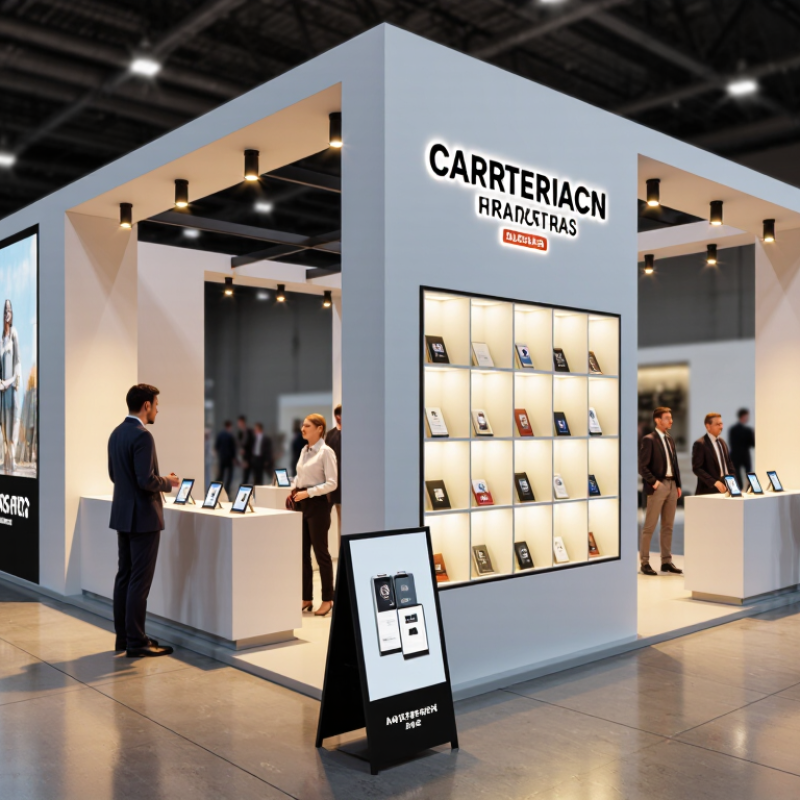
Define the audience in practical terms. Identify job role, buying authority, industry pressure, budget stage, and likely objections. Then map the buyer journey from aisle to action. A visitor may notice a high-contrast message, pause at a working sample, ask a technical question, and request a quotation. Each moment needs a physical cue. Use open sightlines, readable pricing logic, a staffed demonstration counter, and a quiet table for serious discussions. Do not hide the next step behind decoration. Simple works better.
Test the journey with someone unfamiliar with your offer. Ask where they would stand, what they understand, and what they would do next. Time the route. If they need three explanations, the design is not ready. We once assumed visitors wanted a long presentation; many preferred a two-minute proof and a printed specification sheet. That mistake changed our layout and staff training. Leave space for uncertainty. Real buyers may enter from the wrong side, arrive with a colleague, or leave before speaking. A flexible stall protects the goal when plans meet reality.
How to Design an Exhibition Stall for More Buyers in 2026
Recommended planning allocation across the exhibition buyer journey
Start with a clear exhibition goal, then design the stall around the audience’s decision process. Allocate the most effort to attracting qualified visitors and converting conversations into measurable follow-up actions.
Build a Strong Visual Identity with Clear Product Messaging
How to Design an Exhibition Stall for More Buyers in 2026
An exhibition stall must communicate before a salesperson speaks. Build one visual identity around two colors, one typeface, and a recognizable shape. Repeat these elements across the fascia, counters, brochure covers, and staff clothing. Consistency helps visitors remember you after a crowded day.
Use a large headline that names the customer outcome, not merely the product.
For example, “Cut setup time by 30%” is clearer than “Advanced display systems.” Support that promise with a close photograph, a short proof point, and a visible demonstration. Keep the strongest message at eye level. That matters.
Product messaging should answer three practical questions:
What is it?
Who benefits?
Why trust it?
Place answers beside the relevant product, not on a distant wall. A working sample, labelled diagram, or measured comparison can turn curiosity into a useful conversation. Train staff to repeat the same plain-language explanation, while allowing honest questions.
Avoid crowded panels and tiny specifications. Visitors rarely stop to decode them. I have seen attractive stalls lose leads because their message changed between the banner and the sales desk. That flaw is easy to miss during planning.
Test the design with someone unfamiliar with your business. Ask them to explain the offer after ten seconds. If they guess incorrectly, revise the headline, not the visitor.
Add Interactive Features That Encourage Meaningful Conversations
An exhibition stall should do more than attract passing eyes. It should make buyers comfortable enough to speak. In 2026, interactive design can turn a brief pause into a useful business conversation. A touch display could let visitors choose their industry, challenge, or purchasing goal. The screen then presents relevant questions, not random product features. Keep it simple. A clear question often opens the strongest dialogue.
Physical interaction can work equally well. A small materials wall, live demonstration, or problem-solving station gives visitors something concrete to discuss. Staff should stand nearby, but not interrupt immediately. I have found that people share more when they can explore first. A flashy game may draw a crowd, yet it can waste everyone's time. That is an important design warning. Interaction must support a business need, such as comparing options, identifying obstacles, or arranging a qualified follow-up.
Test every activity with real users before the exhibition begins. Watch where they hesitate, what they misunderstand, and whether staff explain the next step clearly. Offer accessible controls, readable text, and a quieter conversation area. Ask permission before recording contact details. Measure meaningful outcomes, including completed consultations and useful questions, rather than visitor numbers alone. Some features will fail. That is acceptable if the team reviews the evidence and improves the stall for the next event.
Measure Visitor Engagement and Improve the Stall for Future Events
How to Design an Exhibition Stall for More Buyers in 2026
Measure Visitor Engagement and Improve the Stall for Future Events
A successful exhibition stall should create measurable buying interest, not only visual attention. CEIR research reports that about 81% of exhibition attendees influence purchasing decisions. This makes qualified conversations more valuable than raw visitor counts. Track dwell time, product demonstrations, questions asked, and follow-up requests. Measure the pause. A visitor who stays for three minutes may show stronger intent than five quick scans.
Use a simple engagement sheet or digital counter at each interaction point. Record which display attracts attention, where visitors stop, and when conversations end. Group leads by urgency, product interest, and next action. This reveals whether your layout supports real decisions. It also protects the team from guessing. Collect data with clear visitor consent and avoid storing unnecessary personal details.
Review the numbers within 48 hours. If many visitors stop but few request information, the message may be unclear. If demonstrations finish often but conversations remain short, the offer may lack relevance. Our first layout was too clever. We missed quieter visitors near the side wall. Future stalls should test two entrance paths, clearer signs, and one focused demonstration. Freeman’s 2024 Trends Report highlights the continuing value of interactive, human-centered event experiences. Yet interaction alone is not proof of success. Compare engagement by location, time, and visitor type, then change one element before the next event. Small tests create more reliable improvements than expensive redesigns.
How to Design an Exhibition Stall for More Buyers in 2026 - Measure Visitor Engagement and Improve the Stall for Future Events
Anonymized exhibition performance comparison showing how visitor-engagement data can guide stall improvements.
| Engagement Metric |
How It Is Measured |
Previous Event |
2026 Event |
Change |
Recommended Stall Improvement |
| Qualified visitors |
Visitors who match the target customer profile and speak with staff |
186 |
241 |
+29.6% |
Use clear overhead messaging and an open three-sided layout to improve visibility and access. |
| Average dwell time |
Average time a visitor remains inside the stall area |
2m 18s |
3m 07s |
+35.5% |
Add a concise product demonstration, comfortable standing points, and visible comparison panels. |
| Product demonstrations |
Completed demonstrations recorded by booth staff or a digital interaction system |
54 |
83 |
+53.7% |
Place the demonstration within the first visible zone and schedule repeated sessions at fixed times. |
| Lead capture rate |
Captured leads divided by qualified visitors |
31.2% |
42.7% |
+11.5 pp |
Use a short mobile form with permission-based follow-up and offer a useful digital resource. |
| High-intent leads |
Leads requesting a quote, trial, consultation, or buying discussion |
38 |
67 |
+76.3% |
Create a dedicated consultation area and use qualifying questions before handing leads to sales staff. |
| Repeat visitors |
Visitors identified as returning to the stall during the same event |
12 |
26 |
+116.7% |
Use interactive content, appointment reminders, and a visible event timetable to encourage return visits. |
| Meetings booked |
Confirmed post-event sales or consultation meetings scheduled at the stall |
16 |
29 |
+81.3% |
Add calendar booking via QR code and reserve a quieter area for detailed buyer conversations. |
| Post-event response rate |
Leads responding to the first follow-up message within seven days |
28.4% |
39.1% |
+10.7 pp |
Send personalized follow-up within 24 hours and reference the visitor’s stated interest or business need. |
| Cost per qualified lead |
Total stall and event activation cost divided by qualified leads |
$142 |
$101 |
−28.9% |
Reuse modular structures, focus budget on high-performing engagement zones, and reduce low-value printed materials. |
| Visitor satisfaction |
Average score from a voluntary one-to-five post-visit survey |
3.8 / 5 |
4.4 / 5 |
+15.8% |
Maintain clear navigation, reduce visual clutter, and train staff to begin conversations with visitor-focused questions. |
Measurement note:
Use the same definitions, tracking period, staffing level, and event-cost calculation at every exhibition so that performance changes can be compared accurately.

 Contact Us